Testing Beauty, One Click at a Time:
Ulta Meets Target’s Red
As the Associate Creative Director and Design Manager at Target, I led the design and testing for the Ulta Beauty at Target campaign, merging bold branding with strategic innovation.
The project consisted of two parts: first, redesigning the creative elements to align Ulta’s branding with Target’s Inspiration Discovery framework while ensuring ADA compliance. The second part involved testing the redesigned elements for their effectiveness in driving engagement and conversion across various campaign messages.


Challenge
Ulta's bold aesthetic must align with Target's structured branding while keeping its identity.
Existing templates limit adaptability, complicating integration.
Approach
Adjusted Ulta’s vibrant palette to complement Target’s branding while staying ADA-compliant.
Transformed rigid templates into adaptable, modular designs.
A/B tested layouts, messaging, and CTAs to optimize engagement and conversion.
Solution
Applied UX/UI refinements for a seamless customer experience.
Balanced Ulta’s boldness with Target’s structure across all touchpoints.
Built a flexible framework for future campaigns, ensuring consistency and efficiency


The Challenge:
Balancing Beauty and Branding
The Ulta Beauty at Target campaign faced the challenge of integrating Ulta’s vibrant branding with Target’s cohesive design while ensuring ADA compliance and user engagement.
Ulta’s pink and orange colors clashed with Target’s red, leading to visual dissonance. Additionally, the existing Inspiration Discovery templates lacked the sophistication needed to highlight Ulta’s premium products.
The marketing team aimed to explore whether adapting Target’s design system could boost excitement and drive digital conversions. The project was divided into two main parts: designing the creative framework and executing creative testing.

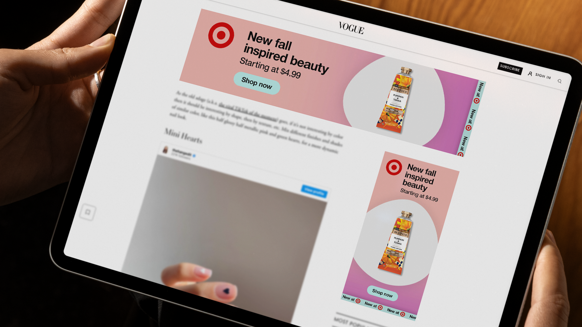
Previous Target x Ulta Campaigns
Laying the Foundation: Examples of Work That Informed Test A


Part 1:
Creative Shell Development
We retrofitted the "Inspiration Discovery" creative shell by focusing on key areas to improve brand synergy and accessibility.
Color Adjustment
We softened Ulta’s bold pinks and oranges to harmonize with Target’s red, ensuring a vibrant palette that meets ADA compliance.
Creative Transformation**: We modernized the shell with refined layouts, enhanced images, and animation improvements to highlight products while maintaining a sophisticated design.
UX/UI Integration**: We applied UX and UI best practices to digital assets, including interactive and video units, to boost campaign effectiveness and user engagement.


The final creative shell successfully integrated Ulta’s branding into Target’s digital ecosystem while maintaining the flexibility to accommodate diverse campaign needs.
Part 2:
Creative Testing
The creative testing phase comprised two parts, focusing on standard display media units.
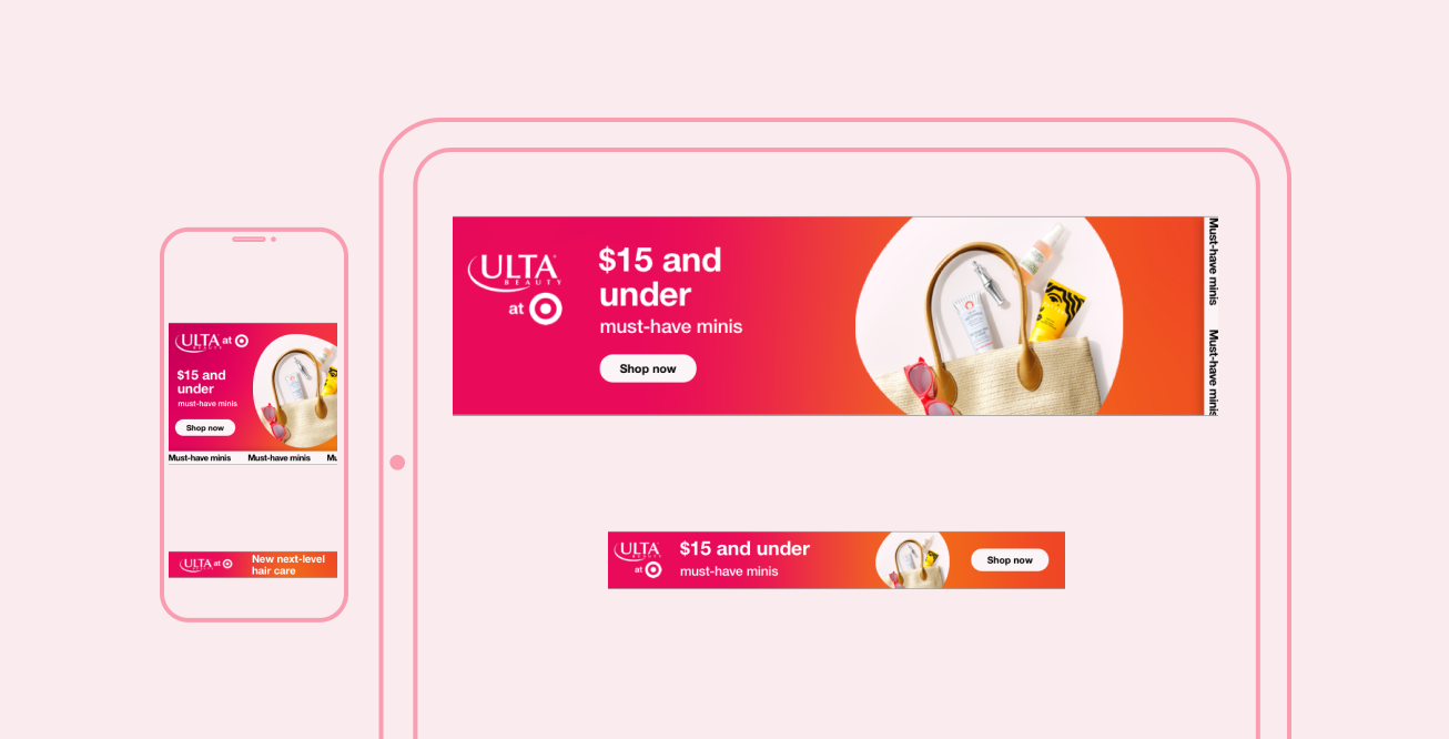
Phase 1: Initial tests evaluated key messages like "Minis $15 & Under" and "Newness."
Phase 2: Follow-up tests introduced "Minis - $20 & Under" to assess variations in audience response and conversion rates.

Results:
My team effectively adapted Ulta’s branding into the Inspiration Discovery creative framework. The updated design highlighted the product and enhanced visual engagement.
Both creative versions performed similarly, but testing results were inconclusive. While the Inspiration Discovery framework was visually appealing and ADA-compliant, there was no clear preference between the original and updated designs.
Improvements can be made, especially in refining the logo lockup and copy layout. Additional design flexibility could further enhance the final results.