Konekt Branding & U.S. Market Launch
Brand Identity, Market Localization, and Digital Rollout
Context
Konekt, a trusted payment technology leader with a strong foundation in Asia, partnered with me to evolve its brand and prepare for U.S. market expansion. Building on its legacy as Kargo Card, the goal was to refine the brand identity to better align with the expectations of U.S. enterprise clients—while honoring the global credibility and success already established.
We worked cross-functionally across global teams—including our colleagues in Shanghai—to ensure a seamless transition and maintain brand equity throughout the process.
Approach
I led the U.S.-focused rebranding effort—from design to execution. We developed a fresh visual identity, reimagined core brand assets, and launched a web presence to accelerate our go-to-market timeline.
The visual system, animations, and illustration library were built with the Konekt team to support global sales initiatives, pitches, and partner enablement.
Challenge
Our focus was to modernize and localize the brand identity for a new audience while ensuring global consistency. The project required a unified system that could support both white-label product storytelling and scalable marketing efforts.
Execution
A connected identity for a global shift.
The new logo was inspired by an original concept from a founding team member—symbolizing connectivity and adaptability. We refined it into a confident, modern identity system with ADA-compliant colors, modular layouts, and iconography built for scalability across products, sales, and digital channels.
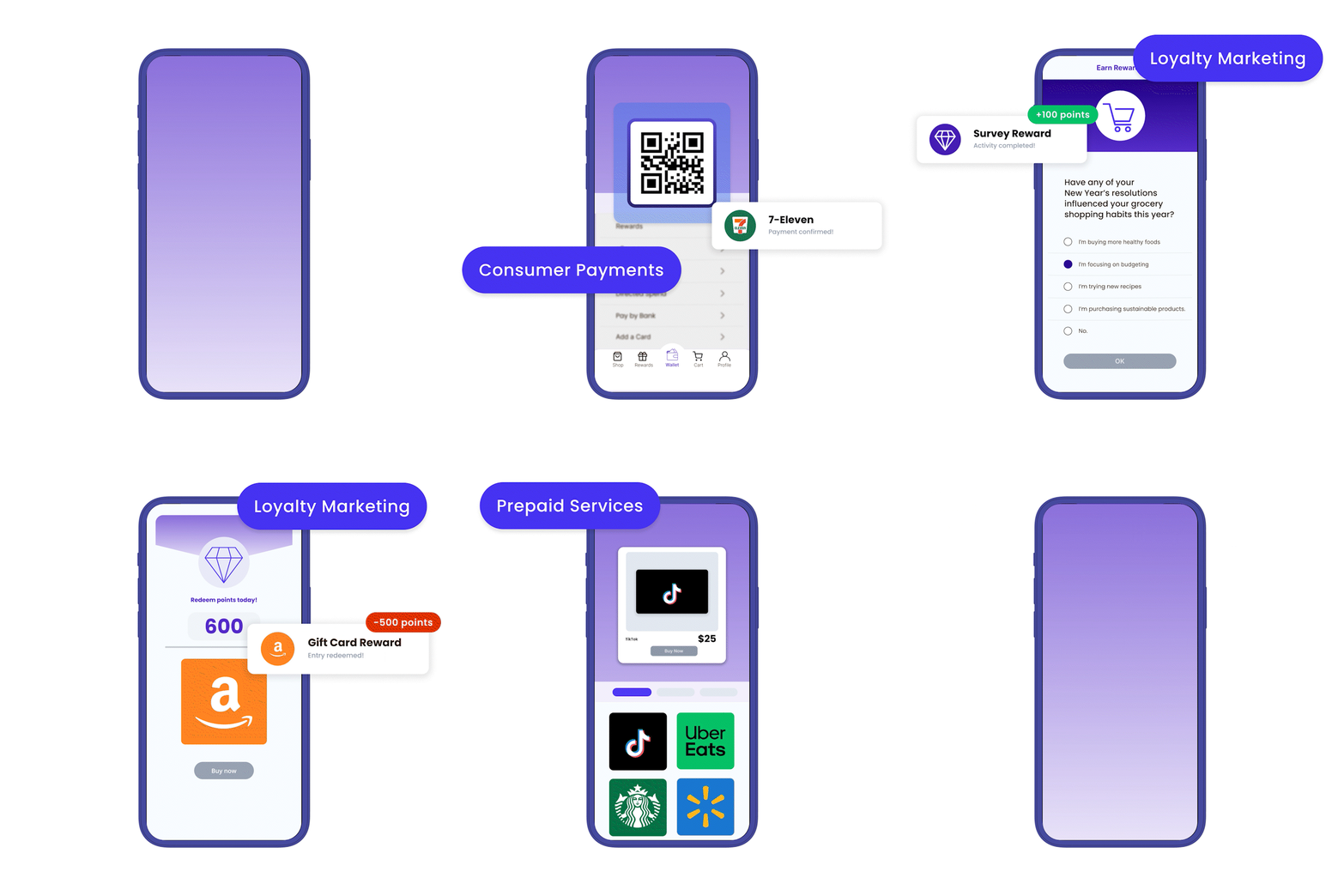
Our illustration and animation assets communicated the white-label product model clearly and effectively, all while protecting proprietary design elements. This system supports everything from client decks to investor pitches.


Logo & Identity:
Designed a bold, flexible logomark and modular brand system to support future growth and U.S. localization. The concept was originally sketched by one of the founding members, aiming to express the idea of seamless connectivity across global touchpoints. We refined it into a simple, elegant, and confident identity—modern and tech-forward without being overly complex.


Illustration & Animation
Created a full set of animated brand elements and scalable illustrations used across the site, decks, and campaigns. These assets were strategically designed to align with Konekt’s white-label app development model—highlighting use cases, architecture, and service flow without revealing proprietary platform details. The clean, modular visual style makes it easy to communicate complex offerings while preserving confidentiality and adaptability.


Website:
Launched an agile focused on speed, credibility, and clear communication—while laying the groundwork for future evolution


Creative Ops:
Delivered all design and production assets within a compressed timeline, enabling a quick go-to-market strategy without sacrificing brand cohesion. I also developed a branded PowerPoint presentation system—templates, layouts, and visual guidelines—to support ongoing pitch work and internal storytelling across teams.

Konekt now enters the U.S. market with a confident, cohesive brand presence that reflects its international credibility and technical leadership.
The new identity has been adopted across internal and external touchpoints, strengthening alignment across global teams.
Services
Logo Design –– Visual Identity –– Illustration –– Animation –– Website Design –– U.S. Localization

