Vena Amoris Jewelry
Crafting Love Stories in Every Piece
As the creative lead, I’ve had the privilege of developing the brand’s visual identity, from the site design to social media and photography, telling these love stories through a lens of authenticity and elegance.
My Role
Branding and Messaging
Online Presence
Content Marketing
Customer Experience


Branding Development
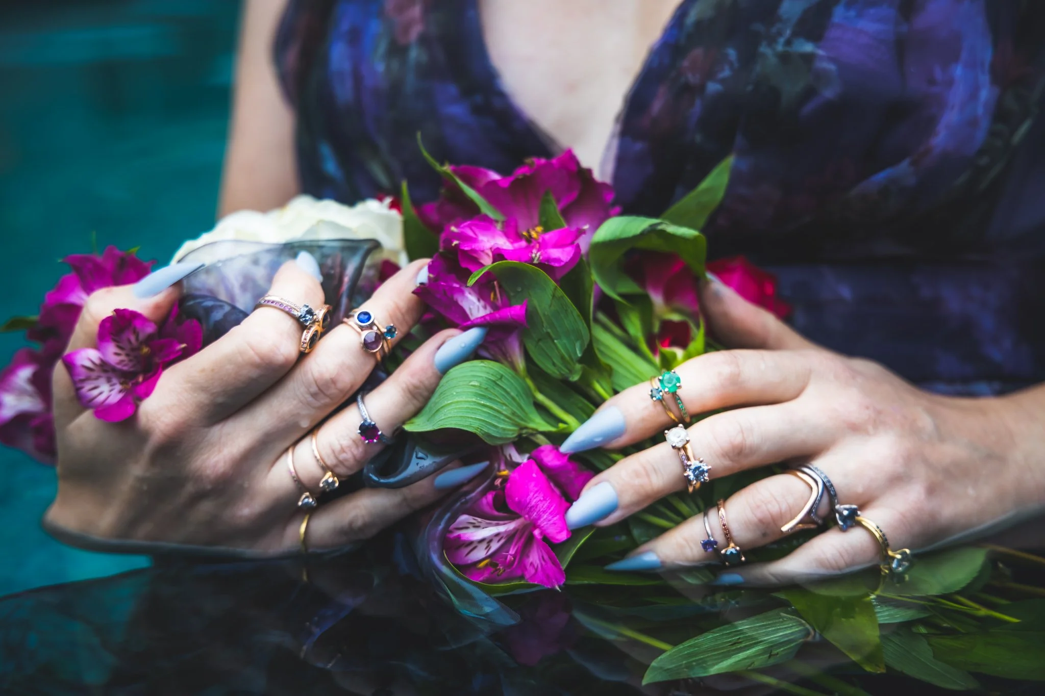
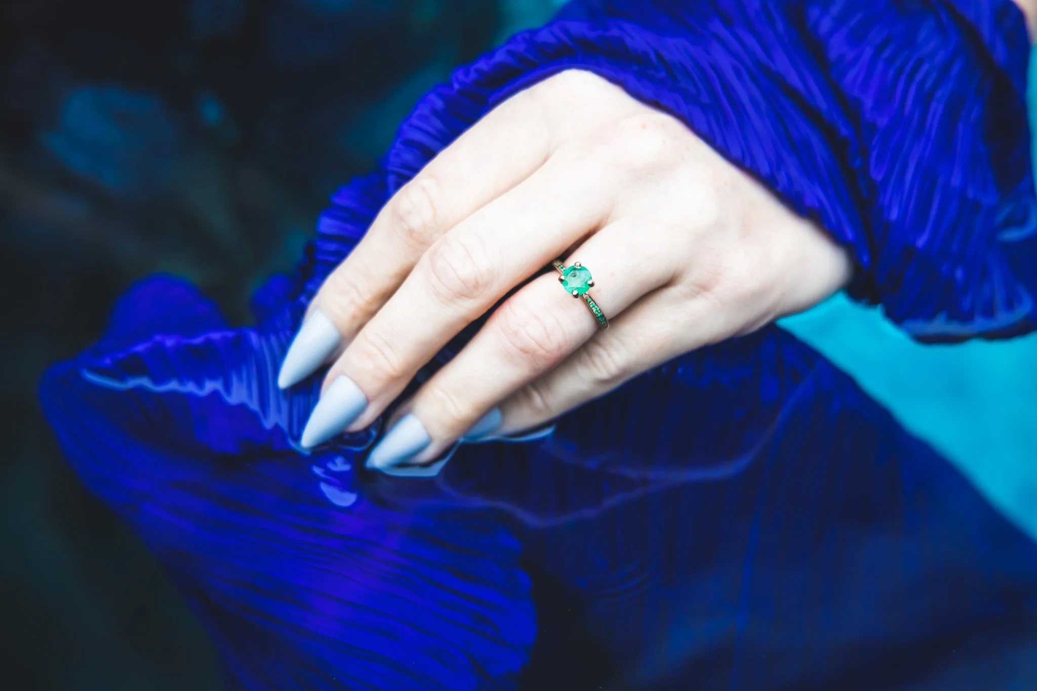
Vena Amoris branding draws inspiration from the deep-rooted history of bridal jewelry, taking its name from the "vein of love"—the ancient belief that a vein runs directly from the fourth finger to the heart. The inspiration for the color palette pays homage to the opulent hues of ancient Roman royalty, infusing the brand with a sense of timeless elegance and historical connection. This blend of meaningful symbolism and rich, regal tones creates a strong foundation for a brand that celebrates enduring love and tradition.
The hero font for Vena Amoris is Granmond Pro, chosen as a nod to classic, hand-carved typefaces that evoke a sense of timeless romance. Its elegant, traditional style complements the brand’s connection to historical bridal jewelry, adding a refined, romantic feel to the branding materials.
This typographic choice enhances Vena Amoris's sense of heritage and love.


The color palette was thoughtfully expanded to ensure ADA compliance and digital friendliness, making it suitable for detailed assets across digital platforms. This adaptation maintains the richness of the original palette while ensuring accessibility and readability, reinforcing Vena Amoris's commitment to an inclusive and user-centric design.